
Iconic race car liveries: 11 Most Stunning Designs in 2025
The Art and Legacy Behind Motorsport’s Most Memorable Paint Schemes
Iconic race car liveries are distinctive color schemes and designs that have achieved legendary status in motorsport history through their visual impact, competitive success, and cultural significance.
Here are the most widely recognized race car liveries of all time:
- Gulf Oil (light blue & orange) – Ford GT40, Porsche 917
- Martini Racing (white with blue/red stripes) – Lancia, Porsche
- John Player Special (black & gold) – Lotus F1 cars
- Marlboro (white & red) – McLaren F1, especially Senna/Prost era
- Rothmans (blue, white & gold) – Porsche 956/962, Williams F1
- Castrol (green, red & white) – Toyota rally cars
- Subaru 555 (blue & gold) – Impreza WRC rally cars
- Pink Pig (flesh pink with butcher-cut labels) – Porsche 917/20
A racing car can be as beautiful as you like, but a brilliant livery can take a middling car and lift it to legendary status. These distinctive paint schemes have transcended their original purpose as sponsor advertisements to become deeply embedded in motorsport culture and fan consciousness.
What makes these liveries so special? Most follow what designers call “the rule of three” – limiting colors to create visual clarity that’s instantly recognizable at 200 mph. The Gulf livery’s powder blue and orange, for example, uses official paint codes 3707 Zenith Blue and 3957 Tangerine that have remained largely unchanged for over six decades.
Beyond aesthetics, iconic liveries tell stories. The Pink Pig Porsche was painted like a butcher’s diagram after Martini refused to sponsor the “ugly” car. Subaru’s blue and gold became so synonymous with the brand that they continued using the color scheme long after the 555 tobacco sponsorship ended.
From Steve McQueen’s film “Le Mans” cementing Gulf’s cultural status to the clever barcode designs that kept Marlboro’s identity alive after tobacco bans, these liveries have survived regulations, sponsor changes, and the passage of time to remain instantly recognizable symbols of speed and beauty.

Must-know Iconic race car liveries terms:
What Makes Iconic Race Car Liveries?
Ever watched a race and recognized a car by its colors before you could even make out the driver or model? That’s the magic of iconic race car liveries – they speak to us in a visual language that needs only milliseconds to register in our brains.
“Like picking the greatest driver of all time, whittling down to the best liveries ever is a task that will never please everyone,” a veteran motorsport commentator once told me with a chuckle. But while opinions may differ, certain elements consistently show up in the most memorable designs.
Color, Simplicity, and Story: Building Iconic Race Car Liveries
The liveries that stand the test of time aren’t just pretty – they’re engineered for impact. Think about it: these designs need to be recognizable when they’re blurring past you at 200 mph!
The most successful schemes rely on high contrast combinations that pop even at tremendous speeds. There’s also what designers call the rule of three – limiting the palette to just 2-3 primary colors creates a clean, instantly identifiable look.
Ever notice how Gulf’s powder blue triggers a sense of calm reliability while that splash of orange signals pure energy? That’s no accident – emotional triggers built into color choices make these liveries resonate on a deeper level.
“A good paint job is worth half a second a lap, easy,” goes an old racing joke. While not literally true (though don’t tell that to the marketing department!), the psychological boost of a striking livery can’t be underestimated – for drivers, teams, and fans alike.
Sponsorship & Regulation: The Tug-of-War Behind Iconic Race Car Liveries
Before 1968, race cars proudly wore their national colors – British racing green, Italian rosso corsa, French blue, or German silver. It was patriotic, traditional, and… not particularly profitable.
| Era | Primary Colors | Example | Key Characteristics |
|---|---|---|---|
| National Colors (pre-1968) | Country-specific | British Racing Green | Patriotic, traditional, minimal graphics |
| Sponsor Era (1968-present) | Brand-specific | Marlboro Red & White | Commercial, evolving, complex designs |
Everything changed when Gold Leaf tobacco sponsored Lotus, turning Formula 1 cars into high-speed billboards practically overnight. Suddenly, those national colors gave way to sponsor-driven designs, with tobacco and alcohol companies leading the charge through the ’70s, ’80s, and ’90s.
When health regulations started clamping down on cigarette and alcohol advertising, teams got creative. Marlboro’s ingenious barcode design maintained brand recognition without explicit logos. Subaru cleverly used “555” numbering to reference State Express 555 cigarettes. And who could forget “Slik Cat” model cars appearing instead of “Silk Cut” branding?
Ironically, these regulatory constraints often sparked the most innovative designs. When designers couldn’t rely on obvious logos, they created subtler yet equally memorable schemes that could weather regulatory scrutiny while maintaining that crucial brand identity.
Want to learn more about how racing innovations extend beyond just pretty paint? Check out our deep dive into Innovative Racing Technology that’s shaping the future of motorsport.
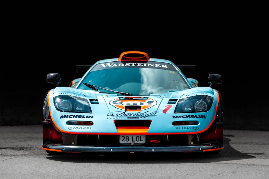
1. Gulf Blue & Orange – The Universal Fan Favorite
There’s something almost magical about that light blue and orange combination. Whether you’re a die-hard racing fan or someone who’s never set foot on a track, chances are you’d recognize a Gulf-liveried race car in an instant. That’s the power of what might just be motorsport’s most beloved paint scheme.
“Gulf’s light blue and orange is arguably the most recognizable livery in the world,” as one motorsport historian puts it. “Even after more than 50 years, it still looks fresh and timeless.”
What makes this combination so special? For starters, there’s the consistency. Those specific shades – officially paint code 3707 Zenith Blue and paint code 3957 Tangerine – have remained virtually unchanged for over six decades. It’s like motorsport’s equivalent of Coca-Cola’s bottle shape – instantly recognizable across generations.
Then there’s the winning pedigree. Gulf’s colors haven’t just adorned pretty cars; they’ve been wrapped around some of racing’s most dominant machines. The Ford GT40s that conquered Le Mans in ’68 and ’69. The gorgeous Porsche 917s that dominated endurance racing. The McLaren F1 GTRs of the 1990s. The Aston Martin DBR9s in the 2000s. Even modern McLaren Formula 1 cars have donned these colors for special one-off races.

Perhaps no moment cemented Gulf’s legacy more than the heart-stopping 1969 Le Mans finish. After 24 grueling hours of racing, Jacky Ickx’s Gulf GT40 crossed the finish line just 120 meters – mere seconds – ahead of Hans Herrmann’s Porsche. It was one of the closest finishes in the race’s storied history, and those blue and orange colors were forever etched into racing lore.
The Steve McQueen boost can’t be overlooked either. When the Hollywood icon featured Gulf-liveried Porsche 917s in his 1971 film “Le Mans,” he introduced these colors to millions who might never have seen a real race. As one enthusiast confessed, “I can’t hold off any longer watching Le Mans again just to spot the subtle differences in stripe placement.”
What keeps this livery so special decades later? Perhaps it’s because, as one commentator observed, “No Gulf-liveried car has ever looked bad – which is why it’s remained relevant for over half a century.” There’s something about that powder blue with the pop of orange that just works, whether it’s screaming down the Mulsanne Straight or sitting quietly in a museum.
In a sport constantly chasing the next innovation, Gulf’s iconic blue and orange remains the gold standard of racing liveries – a perfect blend of beauty, history, and competitive success that continues to capture our imagination.
2. Martini Racing Stripes – Elegance Across Disciplines
There’s something magical about those blue and red stripes flowing across a pristine white background. The Martini Racing livery has a timeless quality that feels both sporty and sophisticated – like a racing suit paired with an Italian custom jacket.
“What can be said about Martini liveries that hasn’t already been said?” a veteran racing journalist once told me with a smile. “The classic white, red and blue stripes guarantee a baseline favorable perception in competition, even on an underperforming car.”
This iconic design first captured the racing world’s imagination on the Porsche 917 that rewrote Le Mans history in 1971. That legendary machine set a distance record that would stand for nearly four decades – an eye-watering 5,335 kilometers (397 laps) at an average speed of 222 km/h. Impressive numbers, but it was the striking appearance that burned into fans’ memories.

While the livery looked spectacular on endurance racers, it was perhaps in the dust and drama of rally competition where the Martini stripes achieved their greatest fame. The sight of a Lancia 037 sliding sideways through a corner, its Martini colors flashing between trees and spectators, remains one of rallying’s most iconic images. The Delta Integrale that followed would continue this tradition, cementing the livery’s place in motorsport folklore.
What makes the Martini scheme so special is its neat simplicity. The clean white base creates a perfect canvas for those distinctive stripes – a design that conveys sophistication perfectly aligned with the Italian vermouth brand’s premium image. Unlike many liveries that look awkward when transferred between different vehicle types, Martini’s design transitions seamlessly across motorsport disciplines.
Over the decades, these beloved stripes have adorned Porsche 917, 935, and 936 endurance racers, Lancia Beta Montecarlo, 037, and Delta rally machines, Brabham Formula 1 cars, and more recently, Williams F1 cars. Each vehicle looked right at home wearing these colors.
“Martini’s color scheme suits both rally cars and endurance racers equally well,” notes a prominent motorsport design expert. “It’s like that perfect outfit that works for both a day at the office and a night on the town.”
This remarkable versatility has helped the Martini livery transcend individual racing categories to become one of the most widely recognized designs in all of motorsport – a true visual ambassador that connects different racing disciplines under one stylish banner.
5. Subaru 555 Blue & Gold – Rally Royalty Turned Brand DNA
There’s something magical about that blue and gold Subaru flying through the air, dirt cascading from its wheels as it lands a perfect jump. This isn’t just a color scheme – it’s a piece of motorsport history that transcended its original purpose to become part of a car manufacturer’s very soul.
The iconic blue and gold livery began as a clever marketing strategy. When Subaru partnered with State Express 555 cigarettes in the early 1990s, they faced the growing challenge of tobacco advertising restrictions. Rather than featuring the brand name directly, they simply emblazoned their rally cars with the number “555” – technically just a number, but one that effectively promoted the cigarette brand while staying on the right side of regulations.
“It’s one of the cleverest workarounds in motorsport history,” explains a rally historian. “Everyone knew exactly what ‘555’ meant, but regulators couldn’t do much about a car wearing numbers.”
The livery reached its legendary status in 1995 when a young, fearless Scotsman named Colin McRae piloted his blue and gold Impreza to World Rally Championship glory. Those heart-stopping moments – McRae’s car perched on two wheels around hairpin turns or catching massive air over Finnish crests – created some of rallying’s most enduring images.
What’s truly remarkable about this iconic race car livery is its afterlife. Long after the 555 sponsorship ended, Subaru continued using blue and gold as its racing colors. Few liveries have made such a successful leap from sponsored scheme to manufacturer identity. Today, Subaru’s World Rally Blue remains one of the most requested colors for their road cars, with enthusiasts willing to pay a premium for this racing heritage.
The timing couldn’t have been better for cementing this color scheme in popular culture. As one fan puts it: “For an entire generation who grew up playing Colin McRae Rally on PlayStation, that blue and gold Subaru is what rallying looks like.” The distinctive livery became the face of virtual rallying just as video games were exploding in popularity.
Even today, when you see a modified Subaru WRX on the street sporting blue paint with gold wheels, you’re witnessing the lasting power of this livery. It’s no longer about cigarettes – it’s about flying through forests, conquering impossible terrain, and the raw, untamed spirit of rally racing that Subaru continues to embody.
4. John Player Special Black & Gold – Glamour Meets Performance
When the Lotus Formula 1 team unveiled their black and gold John Player Special livery in 1972, it revolutionized racing aesthetics. The striking combination of deep black with gold accents created an air of sophistication and mystique that perfectly matched the team’s innovative engineering approach.
“The 3.0 CSL is arguably the coolest car ever to wear BMW M stripes,” says one enthusiast, “but no other brand has matched the elegance of John Player Special’s black-and-gold as executed by Lotus.”
The JPS livery adorned some of the most technically advanced F1 cars of their era, including the ground-effect Lotus 79 that carried Mario Andretti to the 1978 World Championship. The black and gold scheme became so synonymous with success and innovation that it’s been periodically revived, most recently on the Lotus E21 in 2013.
What made the JPS livery special was its inversion of conventional wisdom. While most race cars used bright colors for visibility, the black Lotus with subtle gold accents created a mysterious, almost predatory presence on track. The design’s success showed that sophistication could be as effective as flash in creating a memorable identity.
As one design critic noted, “Countless imitators fail to match the exact shade of JPS gold.” This attention to detail – using precisely the right metallic finish – helped lift the livery from merely attractive to truly iconic.
7. Castrol Green-Red-White – Japan’s ’90s Tour de Force
If you spent any time playing racing video games in the 1990s, the Castrol livery’s distinctive green, red, and white color scheme is probably etched into your memory forever. This eye-catching trio of colors reached legendary status on Toyota’s rally and touring cars, earning what many experts consider “the greatest motorsport livery of all time due to its widespread use and instant recognizability.”
The Castrol livery reached its pinnacle of fame on the mud-slinging Toyota Celica GT-Four in the World Rally Championship and the sleek, circuit-dominating Supra in Japan’s JGTC (now Super GT) series. There was something magical about seeing that dark green base with its vibrant red and white accents powering through forests or battling wheel-to-wheel on asphalt.
“I could spot a Castrol Toyota from the other side of a rally stage,” recalls one longtime WRC fan. “Even covered in mud, that green-red-white combination just stood out like nothing else.”
What made this livery work so brilliantly was its perfect color balance. The deep green base created a professional, stable foundation, while the red and white accents delivered the visual punch needed to stand out whether flying through Finnish forests or screaming down the Fuji straight. The design’s high-contrast elements ensured it remained recognizable at any speed, in any conditions.
“No car has ever looked bad with Castrol sponsorship,” notes one design expert. “It’s a scheme that somehow manages to look both aggressive and clean at the same time.”
The livery’s cultural impact extended far beyond actual racetracks thanks to its starring role in iconic racing video games like Sega Rally and Gran Turismo. For countless racing fans worldwide, their first exposure to motorsport came through these games, cementing the Castrol colors as the definitive look of a racing Toyota. That distinctive green-red-white flash became the visual shorthand for speed in an entire generation’s imagination.
Toyota’s Castrol-liveried cars came heartbreakingly close to WRC glory in 1998. Carlos Sainz was leading the championship until his engine dramatically failed just 300 meters from the finish of the final stage – a moment that still makes rally fans wince more than two decades later. Despite this crushing disappointment, the Castrol-Toyota partnership remains one of the most visually memorable in rally history.
Beyond Toyota, the Castrol livery also found success on the Honda Accord in the British Touring Car Championship, proving the color scheme’s versatility across different manufacturers and racing disciplines. Few liveries have managed to look equally at home on rally stages, Japanese circuits, and British touring cars – a testament to the design’s enduring appeal.
6. Porsche “Pink Pig” – From In-Joke to Museum Masterpiece
Not all iconic race car liveries are born from corporate marketing meetings. Sometimes, the most memorable ones emerge from a moment of creative desperation and a healthy dose of German humor.
The story of the Porsche 917/20 “Pink Pig” began with an engineering experiment. Porsche had already tasted success with their 917 race cars, but engineers wanted to create something even more aerodynamic. Working with French aerodynamics company SERA, they developed a wider, more rounded 917 variant that looked… well, a bit odd.
“The Pink Pig racing livery started life as a bit of an in-joke, but the car itself was a serious competitor,” explains a Porsche historian. When Martini, Porsche’s regular sponsor, took one look at the bulbous creation, they politely declined to put their iconic stripes on what they considered an “ugly” car.
Rather than be discouraged, Porsche’s designers acceptd the awkwardness. If the car looked like a pig, why not lean into it? They painted the entire vehicle flesh pink and, in a stroke of genius, added butcher-cut diagrams across the body, labeling different sections in German as if it were a pig ready for the butcher shop. “Haxe” (knuckle) adorned the front wheels, while “Schinken” (ham) marked the rear haunches.

The car was immediately nicknamed “The Pink Pig,” “Big Bertha,” or my personal favorite, “The Truffle Hunter of Zuffenhausen.” Despite its comical appearance, this porcine racer was seriously quick. It qualified seventh for the 1971 Le Mans 24 Hours and was running in third place by the halfway mark before retiring with brake failure.
What makes the Pink Pig special isn’t just its unusual appearance, but how it’s transformed from an engineering oddity into a beloved cult classic. The car that sponsors once rejected now holds a place of honor in the Porsche Museum in Stuttgart, drawing crowds of admirers every day.
The Pink Pig’s story came full circle in 2018 when Porsche revived the livery for their 911 RSR at Le Mans. In what can only be described as poetic justice, the modern Pink Pig won its GTE Pro class, prompting one commentator to quip, “The Pink Pig had finally brought home the bacon.”
This quirky livery has also become a merchandising goldmine, with Pink Pig models, t-shirts, and posters consistently ranking among Porsche’s best-selling collector items. As one Porsche executive observed, “Despite a single competitive outing, the Pink Pig continues to capture hearts over five decades later.”
The scientific research on Porsche Pink Pig shows how a moment of creative improvisation can sometimes create more lasting impact than the most carefully planned marketing campaigns. Sometimes, the most iconic race car liveries aren’t the ones that win the most races – they’re the ones that make us smile.
7. Castrol Green-Red-White – Japan’s ’90s Tour de Force
If you spent any time playing racing video games in the 1990s, the Castrol livery’s distinctive green, red, and white color scheme is probably etched into your memory forever. This eye-catching trio of colors reached legendary status on Toyota’s rally and touring cars, earning what many experts consider “the greatest motorsport livery of all time due to its widespread use and instant recognizability.”
The Castrol livery reached its pinnacle of fame on the mud-slinging Toyota Celica GT-Four in the World Rally Championship and the sleek, circuit-dominating Supra in Japan’s JGTC (now Super GT) series. There was something magical about seeing that dark green base with its vibrant red and white accents powering through forests or battling wheel-to-wheel on asphalt.
“I could spot a Castrol Toyota from the other side of a rally stage,” recalls one longtime WRC fan. “Even covered in mud, that green-red-white combination just popped like nothing else.”
What made this livery work so brilliantly was its perfect color balance. The deep green base created a professional, stable foundation, while the red and white accents delivered the visual punch needed to stand out whether flying through Finnish forests or screaming down the Fuji straight. The design’s high-contrast elements ensured it remained recognizable at any speed, in any conditions.
“No car has ever looked bad with Castrol sponsorship,” notes one design expert. “It’s a scheme that somehow manages to look both aggressive and clean at the same time.”
The livery’s cultural impact extended far beyond actual racetracks thanks to its starring role in iconic racing video games like Sega Rally and Gran Turismo. For countless racing fans worldwide, their first exposure to motorsport came through these games, cementing the Castrol colors as the definitive look of a racing Toyota. That distinctive green-red-white flash became the visual shorthand for speed in an entire generation’s imagination.
Toyota’s Castrol-liveried cars came heartbreakingly close to WRC glory in 1998. Carlos Sainz was leading the championship until his engine dramatically failed just 300 meters from the finish of the final stage – a moment that still makes rally fans wince more than two decades later. Despite this crushing disappointment, the Castrol-Toyota partnership remains one of the most visually memorable in rally history.
Beyond Toyota, the Castrol livery also found success on the Honda Accord in the British Touring Car Championship, proving the color scheme’s versatility across different manufacturers and racing disciplines. Few liveries have managed to look equally at home on rally stages, Japanese circuits, and British touring cars – a testament to the design’s enduring appeal.
10. Red Bull Gives You Wings – Modern Consistency
In a sport where tradition often reigns supreme, Red Bull has managed to create what might be the most instantly recognizable racing identity of the modern era. Their signature matte navy blue base accented with vibrant yellow, red, and silver has become a fixture across the global motorsport landscape.
“Red Bull earns its place among the iconic race car liveries more for its remarkable consistency over decades than for pure artistic beauty,” notes one design critic. Since their bold entry into Formula 1 in 2005, the energy drink powerhouse has maintained an impressively coherent visual language, making only subtle refinements to their core design rather than wholesale changes.
What truly sets the Red Bull livery apart is its seamless application across dramatically different racing disciplines. Whether you’re watching F1, rally, or even aerial racing, that distinctive blue with the charging bull silhouette creates immediate recognition. The same basic scheme appears on everything from the technical masterpieces of Formula 1 to dirt-flinging rally cars, gravity-defying aerobatic planes, and even downhill mountain bikes hurtling through forests.
This visual consistency has created extraordinary brand recognition that transcends any single racing series. As one marketing expert puts it with a smile, “Red Bull’s slogan ‘gives you wings’ might technically be a bit of an exaggeration, but their livery has become so universally recognized that it practically flies on its own.”
The livery reached its competitive peak during Red Bull Racing’s dominant Formula 1 era from 2010-2013, when Sebastian Vettel secured four consecutive world championships. During this golden period, those dark blue cars became synonymous not just with energy drinks, but with front-running performance and championship-winning pedigree.
Red Bull’s innovation extended beyond just color choice – they pioneered the introduction of matte paint finishes to Formula 1, creating a distinctive appearance that immediately distinguished their cars from the glossy competition. This technical innovation demonstrated that even in the highly regulated modern era of motorsport, there’s still room for livery evolution and creative expression.
The staying power of Red Bull’s design language proves that creating an iconic race car livery isn’t just about being flashy or colorful – it’s about consistency, adaptability, and creating a visual signature that works across multiple platforms. Their cross-branding success story offers valuable lessons for any company looking to build recognition through motorsport.
Want to learn more about how racing teams use technology to gain an edge? Check out our article on Racing Simulator Training to see how virtual practice translates to real-world performance.
9. Jägermeister Orange – The Bold Billboard
There’s something almost hypnotic about a bright orange race car thundering down a straight. The Jägermeister livery proves that sometimes the most powerful statements are also the simplest – a single bold color that became one of motorsport’s most recognizable calling cards.
“Jägermeister’s simplicity is why we love it; the orange car with just the logo still stands out,” explains a veteran design critic who’s followed racing liveries for decades. That vivid orange wasn’t chosen by accident – it offered exceptional visibility in all racing conditions, from bright sunshine to twilight endurance races.
The genius of the Jägermeister scheme was how it transformed various cars into instant brand ambassadors. Whether adorning a boxy BMW touring car or a curvaceous Porsche 935, that unmistakable orange turned heads and burned itself into fans’ memories. I still remember my father pointing one out at a race when I was a child – “Look for the orange one!” – knowing it would be easiest for my young eyes to track.
Unlike more complex liveries, Jägermeister’s approach relied on color psychology – orange triggers feelings of enthusiasm and excitement, perfect for motorsport. The design also maximized billboard effect, with the distinctive stag-and-cross logo prominently displayed but never overwhelming the orange canvas.
The livery graced an impressive array of legendary machines through the decades. From the wild Porsche 935 “Group 5” cars with their outlandish aerodynamics to the boxy-but-beautiful BMW M3 E30 touring cars, and from the Ford Capri RS to the Mercedes 190E Evo II, that orange paint scheme liftd every vehicle it touched.
What many fans don’t realize is that Jägermeister’s racing program actually predated Red Bull’s talent development approach. Before the energy drink giant was scouting young drivers, the German liqueur brand was supporting rising stars like Niki Lauda early in his career, before he became a three-time Formula 1 world champion.
The practical benefits of the iconic race car livery extended beyond marketing. TV directors loved featuring the orange cars because they stood out so clearly on screen. Photographers found them easier to track through viewfinders. And team personnel could spot their cars instantly in crowded pit lanes. Form and function in perfect harmony.
Even today, when a historic Jägermeister-liveried race car appears at vintage events, it draws crowds like few others. That’s the power of livery design at its most effective – a perfect blend of visibility, simplicity, and emotional connection that continues to resonate with fans decades after its competitive heyday.
10. Red Bull Gives You Wings – Modern Consistency
In a sport where tradition often reigns supreme, Red Bull has managed to create what might be the most instantly recognizable racing identity of the modern era. Their signature matte navy blue base accented with vibrant yellow, red, and silver has become a fixture across the global motorsport landscape.
“Red Bull earns its place among the iconic race car liveries more for its remarkable consistency over decades than for pure artistic beauty,” notes one design critic. Since their bold entry into Formula 1 in 2005, the energy drink powerhouse has maintained an impressively coherent visual language, making only subtle refinements to their core design rather than wholesale changes.
What truly sets the Red Bull livery apart is its seamless application across dramatically different racing disciplines. Whether you’re watching F1, rally, or even aerial racing, that distinctive blue with the charging bull silhouette creates immediate recognition. The same basic scheme appears on everything from the technical masterpieces of Formula 1 to dirt-flinging rally cars, gravity-defying aerobatic planes, and even downhill mountain bikes hurtling through forests.
This visual consistency has created extraordinary brand recognition that transcends any single racing series. As one marketing expert puts it with a smile, “Red Bull’s slogan ‘gives you wings’ might technically be a bit of an exaggeration, but their livery has become so universally recognized that it practically flies on its own.”
The livery reached its competitive peak during Red Bull Racing’s dominant Formula 1 era from 2010-2013, when Sebastian Vettel secured four consecutive world championships. During this golden period, those dark blue cars became synonymous not just with energy drinks, but with front-running performance and championship-winning pedigree.
Red Bull’s innovation extended beyond just color choice – they pioneered the introduction of matte paint finishes to Formula 1, creating a distinctive appearance that immediately distinguished their cars from the glossy competition. This technical innovation demonstrated that even in the highly regulated modern era of motorsport, there’s still room for livery evolution and creative expression.
The staying power of Red Bull’s design language proves that creating an iconic race car livery isn’t just about being flashy or colorful – it’s about consistency, adaptability, and creating a visual signature that works across multiple platforms. Their cross-branding success story offers valuable lessons for any company looking to build recognition through motorsport.
Want to learn more about how racing teams use technology to gain an edge? Check out our article on Racing Simulator Training to see how virtual practice translates to real-world performance.
11. Honorable Mention – “The Lobster” March 83G
Not every iconic racing livery makes it into the mainstream consciousness. Some develop passionate cult followings among dedicated fans who appreciate their uniqueness and daring design. “The Lobster” is perhaps the perfect example of this phenomenon – a bold, vibrant red crustacean-themed livery that adorned the March 83G IMSA GTP car in the early 1980s.
What made The Lobster truly special wasn’t just its striking red color, but how cleverly it worked with the car’s unique shape. Unlike conventional liveries that simply lay graphics over a car’s body, The Lobster’s designers acceptd the March’s distinctive contours to create something extraordinary.
“The Lobster livery leverages the car’s body contours to create a compelling 3D visual effect,” as one enthusiast perfectly described it. When the car was in motion, it genuinely resembled a giant red lobster scuttling around the track – complete with claws, legs, and beady eyes. This three-dimensional approach was ahead of its time.
The Lobster remains delightfully controversial among racing enthusiasts. “Opinions vary; some dismiss it as non-iconic, others praise its unique 3D effect,” noted one forum contributor. This divisiveness is precisely what makes cult liveries so fascinating – they provoke stronger reactions than safer, more conventional designs.
You can still find The Lobster proudly displayed at the Petersen Automotive Museum, where visitors often stand transfixed before it, trying to absorb its audacious design choices. It’s a testament to how smaller teams with limited budgets can sometimes create the most memorable identities through bold, unexpected creative decisions.
One particularly clever aspect of The Lobster was its self-referential humor. As one designer observed with a chuckle, “One side of the Art Car has a picture of itself printed on the door” – a meta touch that showed racing liveries could be playful and artistic rather than just commercial.
While The Lobster may never achieve the universal recognition of Gulf or Martini, its dedicated following demonstrates that iconic race car liveries can find their place in history through sheer originality and artistic merit. Scientific research on The Lobster livery has even explored how its unconventional approach influenced later designs.
For true motorsport enthusiasts, finding gems like The Lobster is part of the joy of diving deeper into racing history – finding those special designs that mainstream coverage might have overlooked but that represent some of the most creative expressions in the sport’s visual heritage.
Frequently Asked Questions about Iconic race car liveries
Why do some iconic race car liveries survive sponsor bans?
When tobacco advertising was banned from motorsport, many feared classic liveries would disappear forever. Yet the most memorable ones found clever ways to live on – proving that great design transcends its original commercial purpose.
Take Marlboro’s ingenious solution. Rather than abandoning their iconic white and red scheme, they created a barcode-like design that maintained the same visual rhythm and color placement. Fans still knew exactly which brand was being represented, even without seeing the actual logo.
“The best liveries become something bigger than advertising,” explains veteran motorsport photographer James Mitchell. “They tap into emotions and memories that regulations simply can’t erase.”
Subaru offers perhaps the most successful example of livery survival. Their blue and gold color scheme began as State Express 555 cigarette branding, but the combination became so synonymous with rally success that Subaru continued using it long after the tobacco sponsor departed. Today, many Subaru owners apply these colors to their street cars without realizing they originated as cigarette advertising.
The John Player Special black and gold has periodically returned to Lotus cars as a heritage throwback, showing how these designs become part of racing teams’ visual heritage – something fans connect with on a deeper level than mere sponsorship.
How do iconic race car liveries differ between F1, rally, and endurance racing?
Each racing discipline has developed distinctive visual approaches based on their unique environments and challenges.
Formula 1 liveries tend to be the most technically sophisticated, often featuring specialized materials like color-shifting paint, carbon fiber textures, and ultra-lightweight application methods. The sleek, sculpted surfaces of F1 cars create natural canvases for flowing designs and precise sponsor placement. As F1 designer Sam Wise puts it: “Every curve and surface is considered – nothing is accidental.”
Rally cars face much harsher conditions. Their liveries must remain recognizable against dirt, snow, forests, and deserts. This has led to bolder, higher-contrast designs with large color blocks rather than subtle gradients. The iconic Subaru 555 and Martini schemes work brilliantly on rally cars because they maintain their visual impact even when the car is covered in mud or dust.
Endurance racers face a unique challenge – remaining identifiable through day and night. The best liveries in series like Le Mans use strong silhouettes and reflective elements to stand out during night stints.
“You haven’t lived until you’ve seen the Haribo GT3 glowing like a neon sign as it flies down the Mulsanne Straight at 3am,” laughs veteran Le Mans photographer Marie Dubois. Endurance liveries also often incorporate illuminated elements and special reflective treatments to maintain visibility when headlights are the only light source.
Are there underappreciated cult liveries that could become the next icons?
Beyond the household names, racing history is filled with visual gems that command fierce devotion among smaller fan communities – some of which may yet break through to wider recognition.
The orange and green Renown scheme on Mazda’s Le Mans-winning 787B began life inspired by, of all things, a sock design. Yet its vibrant color combination and association with Mazda’s historic 1991 victory have given it a growing following among younger fans finding racing history through social media and gaming.
Flying Lizard Motorsports’ giant reptile head on their Porsches brought playfulness to GT racing, showing that not every livery needs corporate seriousness to be memorable. Meanwhile, the vibrant purple BASF scheme on BMW M1 Procars remains a favorite among collectors and historians despite limited race appearances.
“Today’s social media environment means distinctive designs can find their audience regardless of race results,” notes automotive historian Thomas Reed. “The Newman/Haas Racing Kmart and Havoline schemes from 1990s IndyCar have developed cult followings through YouTube highlights and vintage merchandise collecting.”
The path from cult favorite to mainstream icon often involves crossover into consumer products or media. Just as Gulf colors gained immortality through Steve McQueen’s “Le Mans” film, today’s underappreciated designs might just need the right video game feature or Netflix documentary to become tomorrow’s classics.

Conclusion
When a race car roars past, it’s often the colors we notice first. Iconic race car liveries are more than just pretty paint jobs – they’re visual stories that capture moments in time, technological breakthroughs, and the personalities behind the wheel.
The greatest racing liveries have a magical quality that transcends their original purpose. What started as simple sponsor advertising has evolved into something much deeper – cultural symbols that stir emotions decades after the checkered flag fell. The powder blue and orange Gulf scheme doesn’t just represent an oil company; it transports us to the golden age of endurance racing and Steve McQueen’s Hollywood romance with speed in “Le Mans.”
These visual signatures tell us so much about racing’s rich history. The Pink Pig showcases Porsche’s engineering humor when faced with criticism about an “ugly” car. Subaru’s blue and gold instantly conjures images of Colin McRae’s Impreza flying through forest stages, kicking up gravel as it goes – and later, the democratization of rally-bred performance through affordable road cars.
Racing’s visual language continues to evolve alongside its technology. Hand-painted schemes have given way to precision digital wraps that allow for more intricate designs and quicker changes between events. Yet surprisingly, the principles that made classic liveries successful haven’t changed much – high contrast, limited color palettes, and consistent application remain the foundation of memorable designs.
The best liveries become so intertwined with their cars that it’s hard to imagine one without the other. Can you picture a Gulf-colored Corvette? A John Player Special Ferrari? The disconnect feels wrong because these color schemes have become inseparable from their original vehicles.
Here at Car News 4 You, we believe these rolling canvases deserve celebration not just for their beauty, but for how they connect us to motorsport’s emotional core. Whether you’re drawn to the neat simplicity of Martini stripes or the audacious humor of a giant red lobster, these liveries remind us that racing isn’t just about lap times and horsepower – it’s about passion, identity, and the stories we tell.
Which modern liveries might join this legendary group? The matte blue Red Bull scheme? Mercedes’ sleek silver-to-black transition? Time will tell which of today’s designs will still stir hearts decades from now. For more insights into racing culture and automotive design trends, explore our latest trends and join the conversation about the future of motorsport aesthetics.


1 thought on “Fast, Furious, and Fabulous: The Greatest Race Car Liveries Ever”
Pingback: Rallying Around the Globe: Understanding the International Rally Championship - Car News 4 You
Comments are closed.